
Charting and Exporting Curves
Calculated flow curves can be charted using the buttons at the top of the rating curve grid. The chart/data can be exported to .pdf format/.xlsx format for use in other applications.

To chart the sensor you are working with, click the “Chart Measurement” button in the top left of the workspace. Select the Start and End dates of the data you wish to plot, and select whether you would like to chart the data calculated with the curves or without. The charts are shown as XY scatter point plots in order to show gaps in data. Once the data is charted, selecting “Export to pdf” will create a pdf image of the chart you have generated, or selecting “Export to Excel” will create an Excel file of the data in the chart.
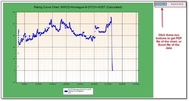
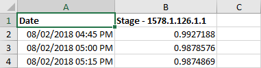
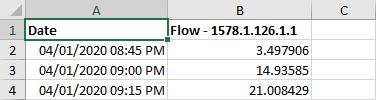
Selecting “Export to Excel” will generate an excel spreadsheet of your data. If you select “”, the uncalculated data will appear in the Excel file. If you select “”, the calculated data will appear in the Excel file. For example:
1. Uncalculated Excel file:
2. Calculated Excel file:
Both charting and exporting calculate on the interface. This means that no changes to the database are made when using these tools.