The Sensor Measurements
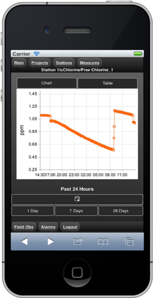
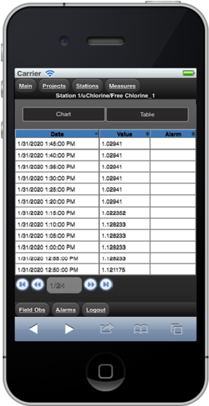
As you follow the Project – Station – Sensor - Measurement path, selecting a measurement name will take you to the visualization window. In our example below, we selected to chart the “Free Chlorine_1” data. On the top of the data window, you will be able to select ‘Chart’ or ‘Table’ to display the data.
Previous menus can be accessed by using either the back button on your mobile device or the tabs at the top of the screen.
 |
 |
|
Chart
|
Table
|
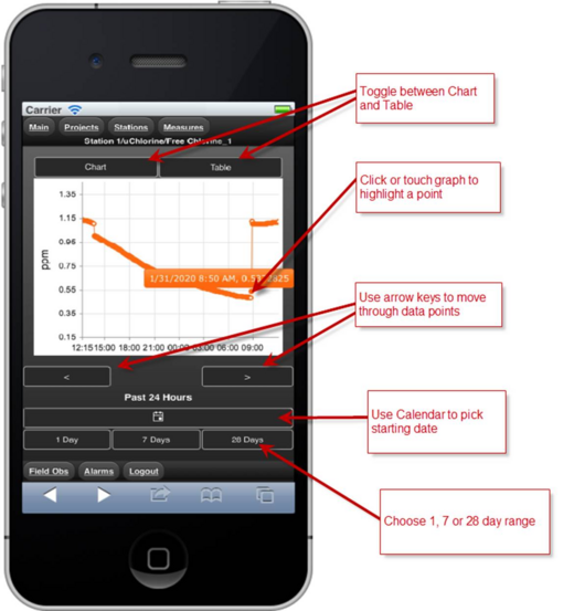
By default, when a measurement is selected the Chart window shows up with a graph of the last 24 hours of data (1 Day). Below the ‘Chart’ window, there are 4 function buttons, including a Calendar selector to change the start date and buttons for 1 Day, 7 Days and 28 Days to change the chart range.
Clicking on a spot on the data chart will display the date, time and value. Left and Right arrow buttons will allow you to move back and forth through the data points to focus on specific events.
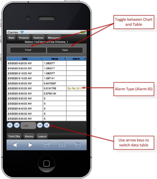
Compared with Chart window, the Table window displays the detail of each data more directly. The table displays twelve rows on each page, which makes the whole window perfect fit the mobile phone screen. Below the table, there are four arrow buttons, you can click those buttons to switch the data. Except the date and value of the data, the data table also has a column for recording the alarm, which is used to display the Alarm Type and Alarm ID of the related data.