Introduction
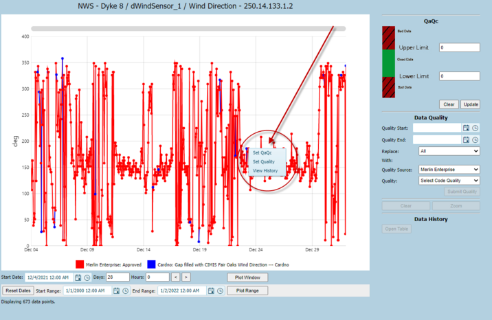
The QA/QC tool has three functions:
1. Data QA/QC: Used to filter out the bad data points. User can easily chart and export only good data points by filtering bad points as QA Fail. Points flagged as QA Fail do not participate in any downstream data viewing or analytics such as charting, exporting or reporting.
2. Data Quality: Used to edit the data quality codes. Data points can be marked as good, bad or questionable – or any other type of code to differentiate data quality or source. Please note that in contrast to the QA Fail flag, all quality code flagged data – even if flagged “bad” will still be used in downstream processes such as plotting, exporting and reporting. Exported data will be flagged as “bad”.
3. Data Revisions: Used to view the history of a data point or associated quality flag.
The Charting Range Controls contain the following.
1. Plot Window: The plot window button will refer to the Start Date and Days/Hours fields and will chart the data based on that. The "<" and ">" buttons will page through the data based on the number of days entered.
2. Reset Dates: Clicking this button to reset the data plot datetime range.
3. Plot Range: Clicking this button will plot the data with the datetime range in ‘Start Range’ and ‘End Range’.
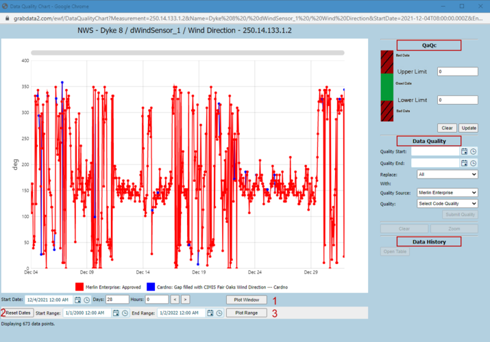
The QA/QC chart will be interactive up to a limit of 300,000 points. If the plot exceeds this limit it will be converted to a bitmap image. To change from a bitmap to an interactive chart the date range must be reduced using the Plot Range dates.
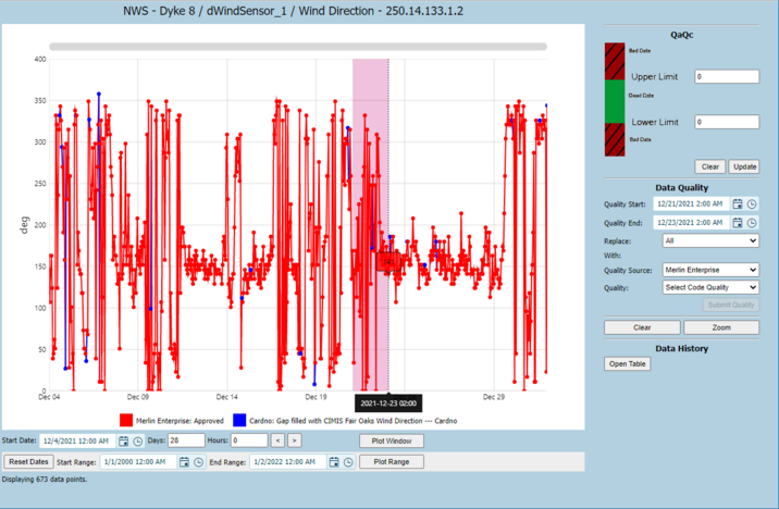
Users can edit single point when the QA/QC chart is interactived by clicking the point.