Chart All
The Chart All button  at the top of the workspace will chart every series in the workspace based on their specified Start Dates and End Dates. The check mark next to the Chart All button is used to specify whether or not the user wants Multi-Axis enabled. If the box is checked, each series will plot with its own separate Y-axis. The checkbox under “Multi Chart” in the workspace indicates which series you want to have generated on the chart.
at the top of the workspace will chart every series in the workspace based on their specified Start Dates and End Dates. The check mark next to the Chart All button is used to specify whether or not the user wants Multi-Axis enabled. If the box is checked, each series will plot with its own separate Y-axis. The checkbox under “Multi Chart” in the workspace indicates which series you want to have generated on the chart.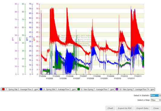
The statistic dropdown allows a selection between Raw data, Average data, and Sum of the data. The step dropdown will calculate these functions based on the selected time interval. The graph below shows this same graph with the Average statistic selected, and the Monthly step selected.
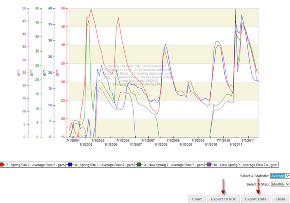
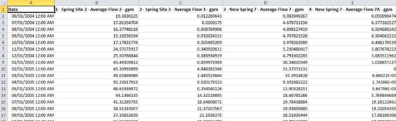
Once the chart with the desired statistical functionality is generated, the user can export the data that is shown, or export the image of the chart via PDF. When selecting Export Data, the data that is graphed (whether calculated or not) will generate to an excel document with each date as a row and each series as a column.