Viewing Sensor Data
When a user left-clicks on a station, a pop-up appears with a list of all sensors associated with that station (see below figure). The background color for each sensor indicates the alarm state as shown in the legend. A user can click on a sensor to generate a modal chart on the screen.
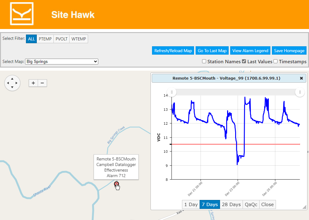
The generated chart can be moused over to show individual points on the chart (date/time and value). The buttons on the modal chart have the following function:
· 1 Day – plot last 24 hours
· 7 Days – Plot last 7 days
· 28 Days – Plot last 4 weeks
· QaQc – Open QA/QC tool as modal pop-up
· Close = Close Modal Chart
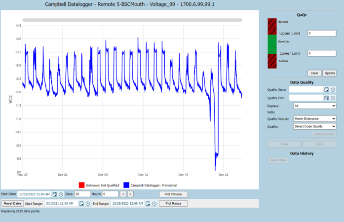
The QA/QC Tool opens a new chart where the date range can be modified and the Qa Qc upper and lower limits can be set for the displayed values.