
Chart
The Chart window displays sparkline plots of all measurements under project/station/sensor/measurement based on the user selection in the Project Tree.
For example, when a user selects a project the chart window displays sparklines for all measurements in that project. There are filter buttons at the top of the Chart window under the project name that filter the displayed charts based on the measurement type defined with the metadata tag called “Button Name” that is assigned to each measurement.
NOTE: Button names are part of the metadata defined for an individual measurement and are automatically assigned on import, but can also be created and edited in the Data Library
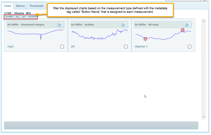
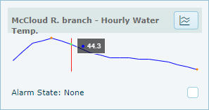
Sparkline plots are simplistic charts that can be rendered quickly. They show a max and min value with an orange dot, and they can be moused over to see a tooltip displaying the value, date and time of each point.
Clicking the Chart icon  in the upper right corner of the sparkline opens an interactive 1/7/28 day chart. Alarm Thresholds will be shown on the chart as a horizontal line if an alarm has been recorded within the time series duration (1/7/28 days).
in the upper right corner of the sparkline opens an interactive 1/7/28 day chart. Alarm Thresholds will be shown on the chart as a horizontal line if an alarm has been recorded within the time series duration (1/7/28 days).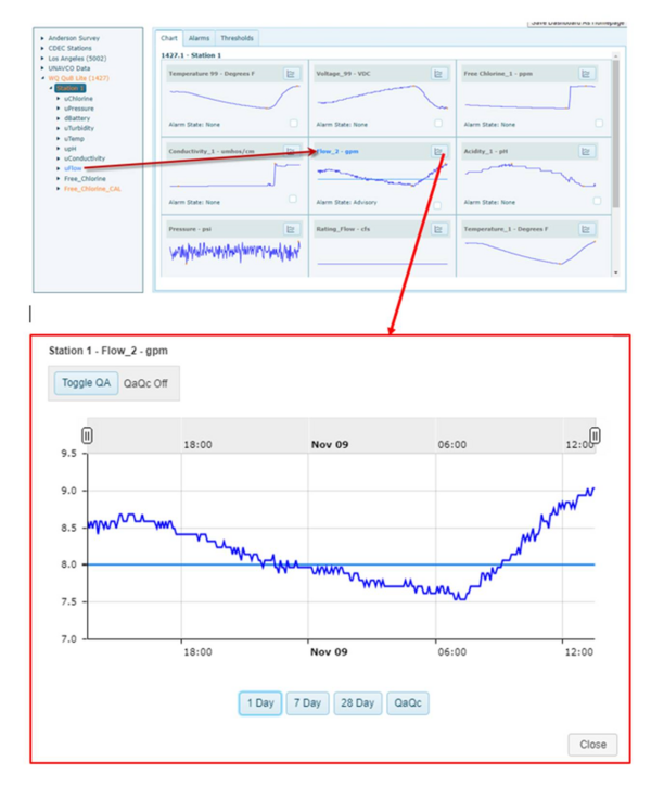
Click 1 Day, 7 Day or 28 Day button to extend the day range of the chart, or click the QA/QC button to open the QaQc chart window. The Toggle QA button at the top left will either hide (QA/QC On) or show (QA/QC On) data points that have been flagged as QA/QC fail.